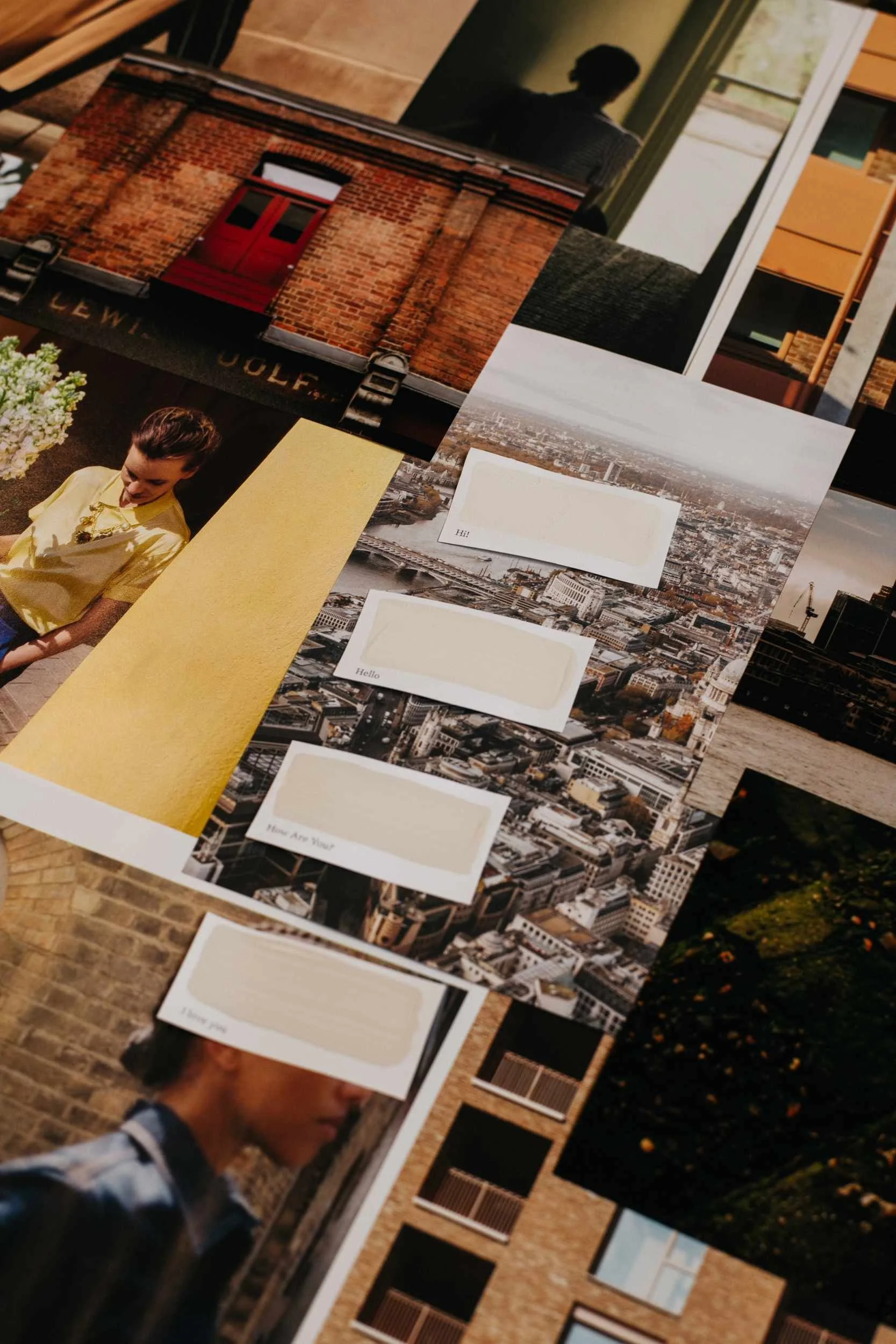
Hi!, Hello, How Are You?, I Love You
Our new neutral family with humans at the centre and a palette that harnesses the power of connection, people and place. Soft and warm shades that remind us to throw shapes with friends and unite with our unknown others, dream big dreams and cross rivers of thought to get from here to there.
Discover the Hello family
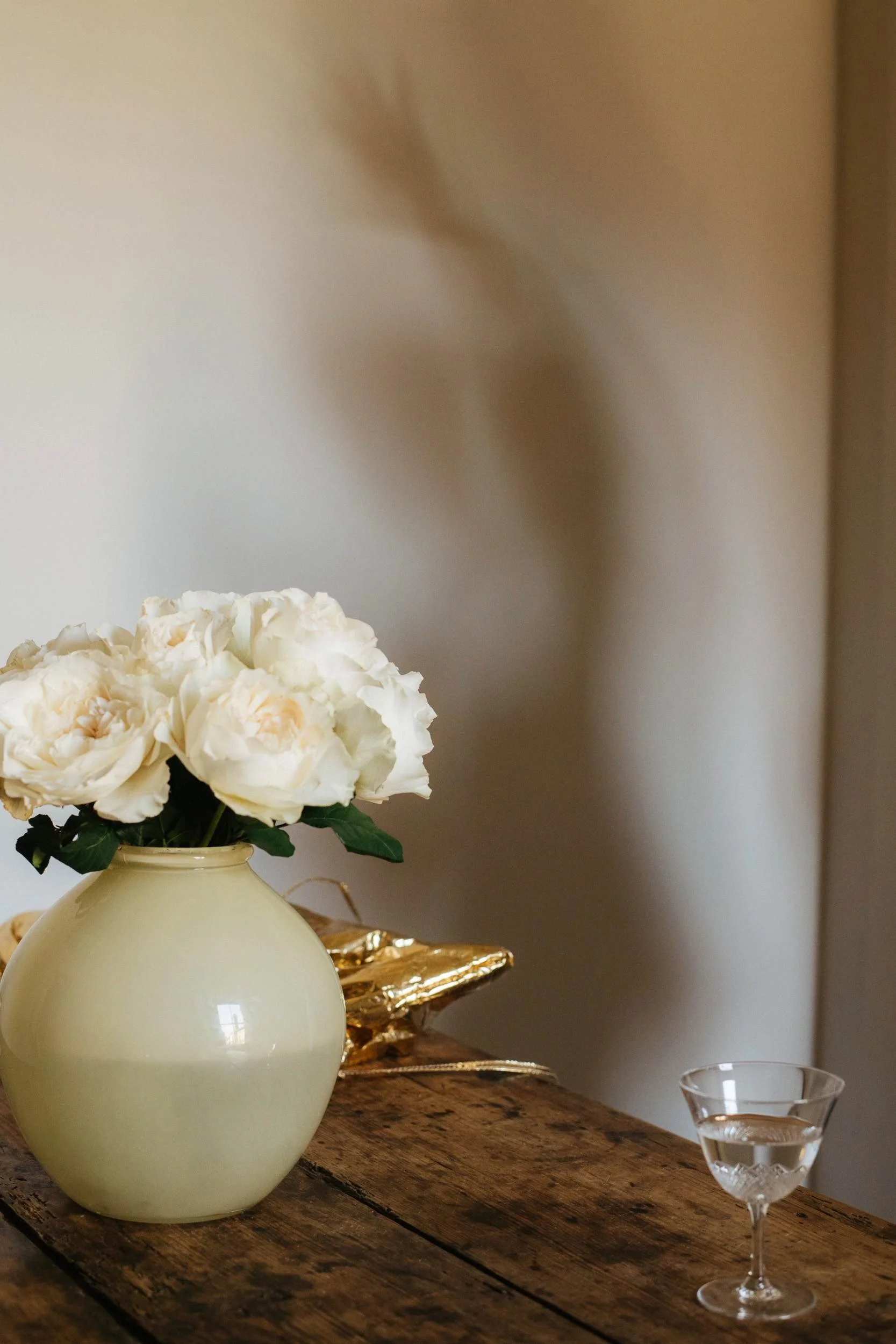
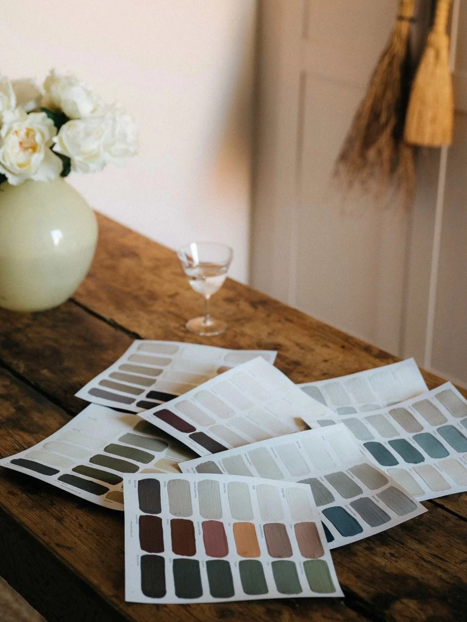
Our family of gentle, soft whites from our latest colour collection, I am/not an Island.
Umber red and yellow ochre pigments create an incredibly useful palette of joyful neutrals.
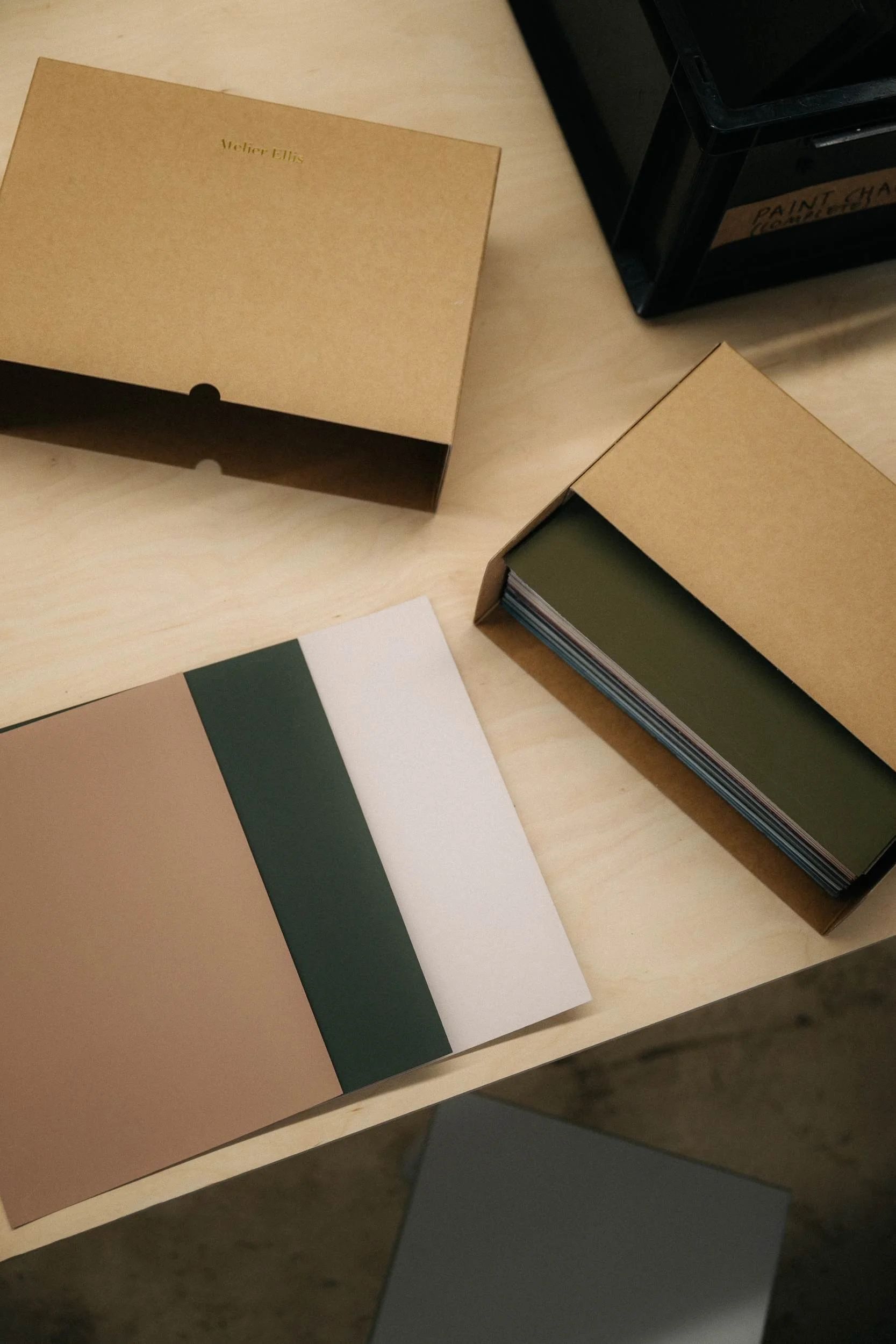
Atelier Ellis makes natural, breathable, bio-based paint and colour to help people tell their story of home
We’re an independent maker of colour, formulating, making, and selling exceptional quality paint. Our colours are thoughtfully researched to create the perfect backdrop for the stories that place people at the centre of their home. Find out more about who we are.
Discover I am/not an Island
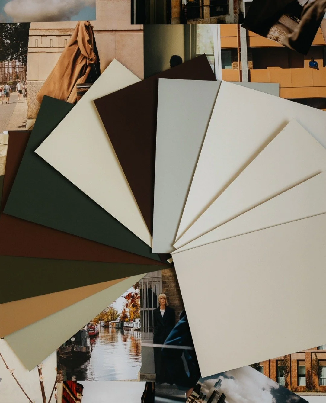
Twelve urbane new colours that harness the power of connection, people and place. Our love letter to London and its river of dreams. These are colours to ground, hold and move you.
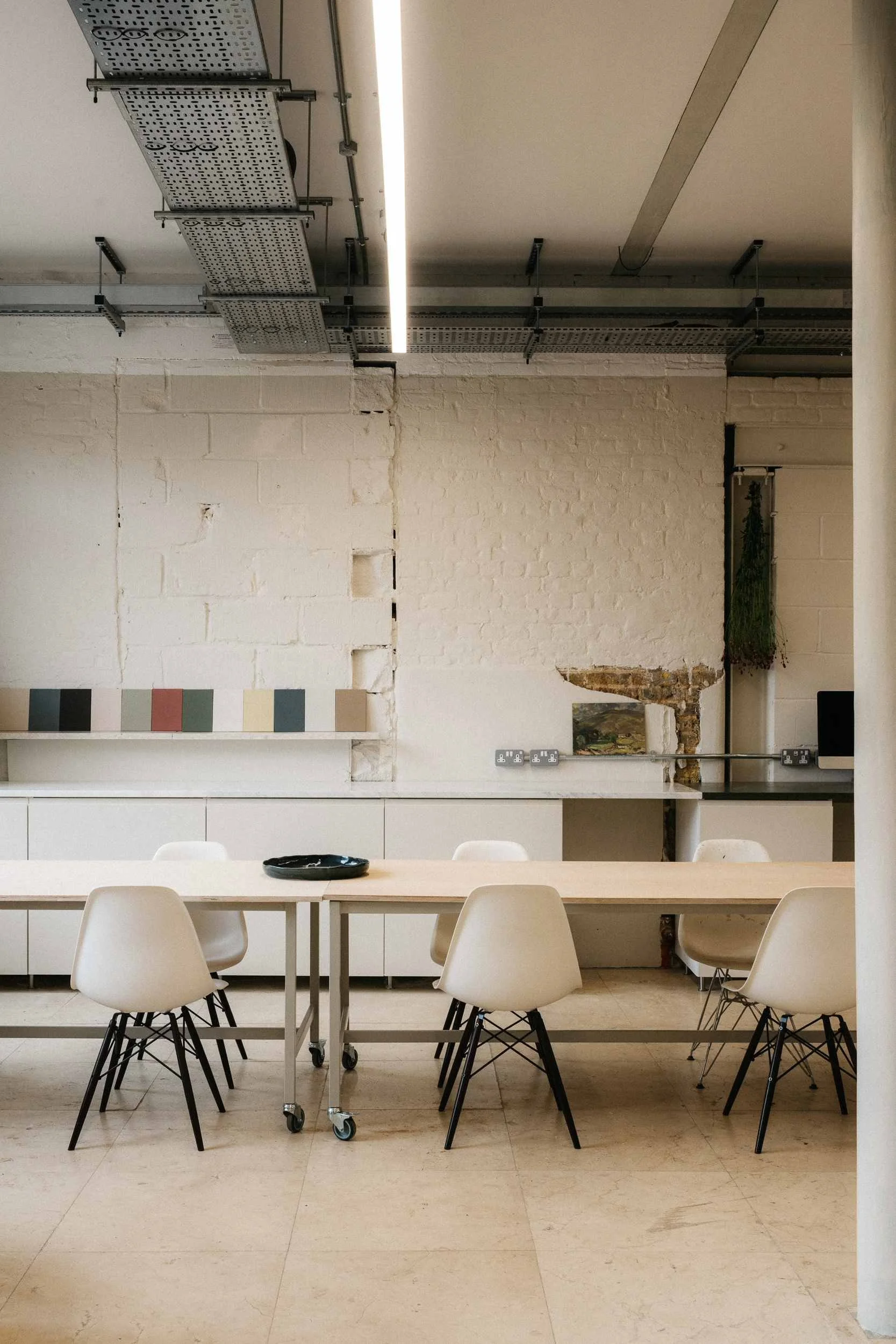
Visit us at our London studio and manufactory
We are delighted to welcome you into our London studio, nestled inside the beautifully restored Bottle Factory in Bermondsey.
Explore our Projects & Articles
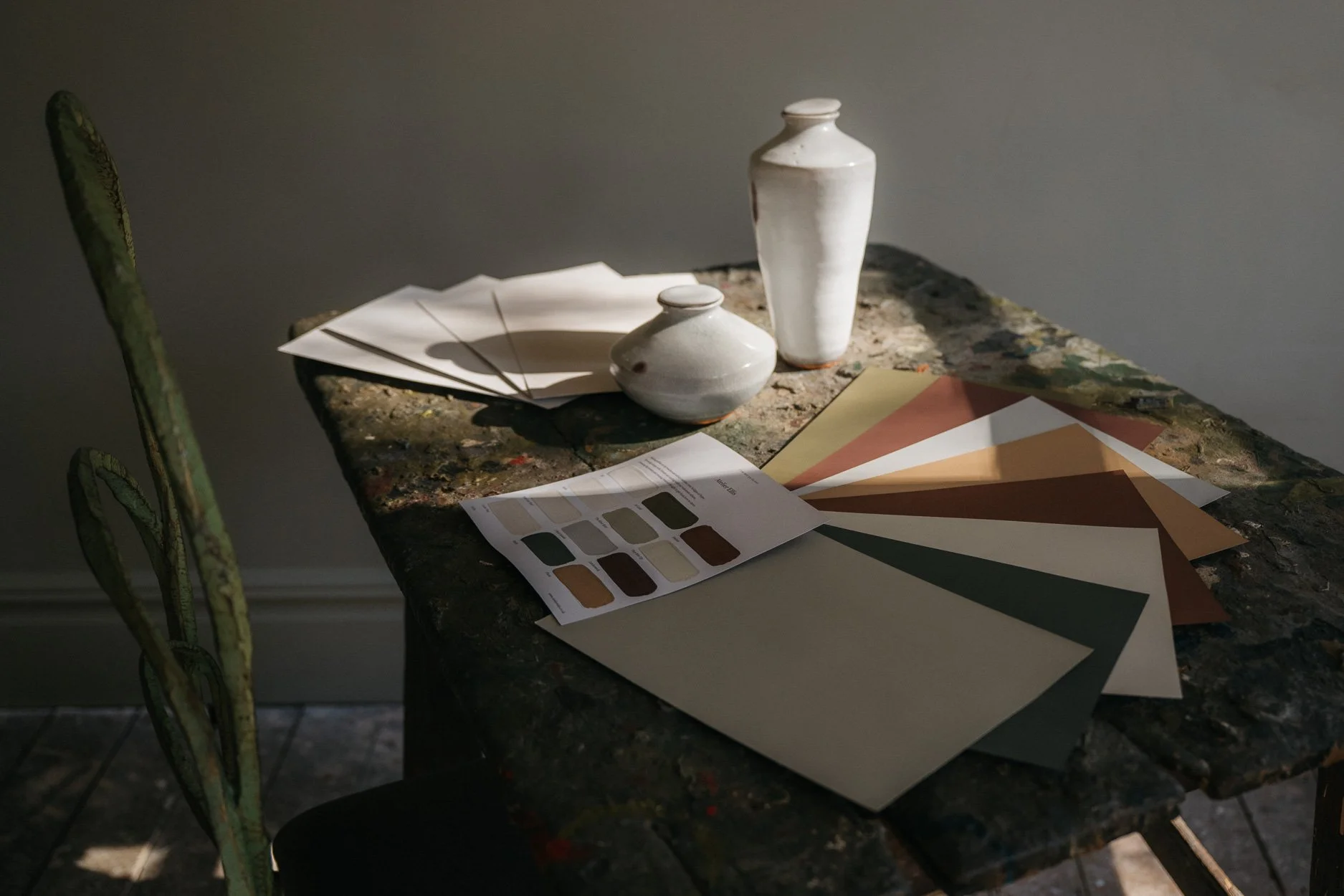
2026 collection: I am/not an Island
I am/not an Island: twelve new colours connecting people and place. A personal palette celebrating unique points of view and all that is best of, and in the beautiful city of London.
Read more →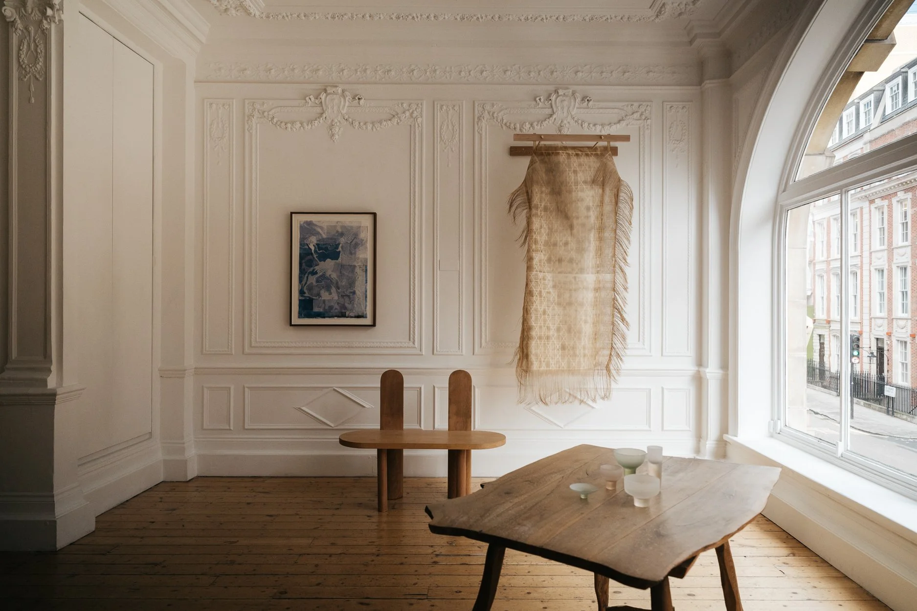
Atelier Ellis Makers 2026: What Colour is Home?
In February 2026, Atelier Ellis, makers of beautiful, breathable bio-based paint, curates and hosts a new creative initiative and exhibition. The inaugural theme is What Colour is Home? Meditations & Conversations.
Read more →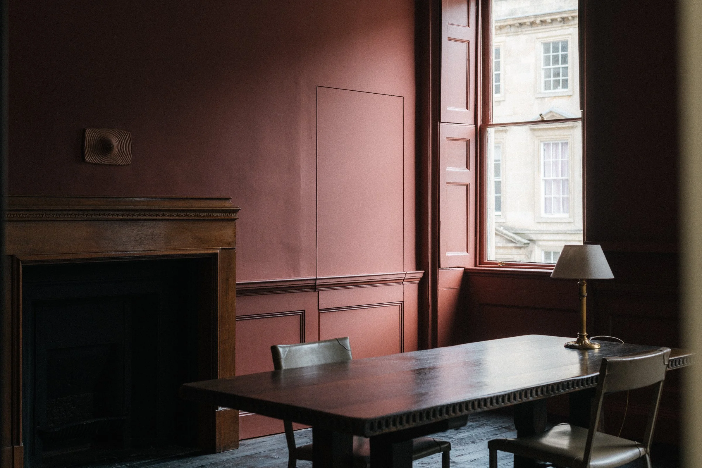
For Konfekt Magazine: Walking over and around the wet Autumnal streets
Walking over and around the wet Autumnal streets, great spots of golden light and glowing embers fall out of windows. Grey months scurry on, bloodshot with sunrises and sets the colour of scarlet wine.
Read more →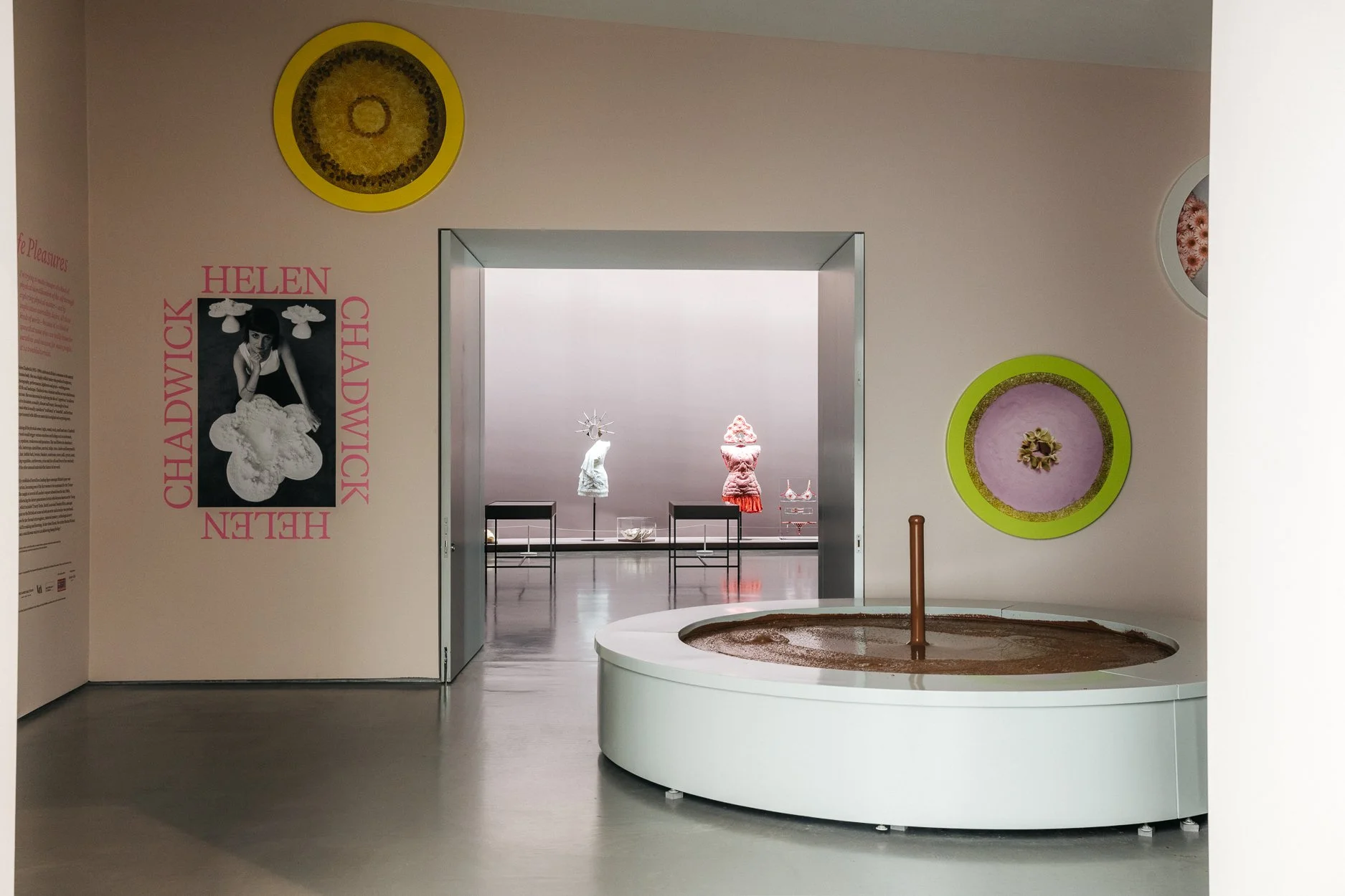
Atelier Ellis x The Hepworth Wakefield
A collection of seven unique hues to celebrate the work of Helen Chadwick and Caroline Walker and their 2025 exhibitions at the Hepworth Wakefield.
Read more →